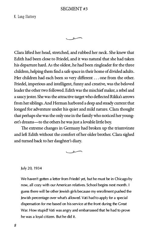
Book design is the graphic art of determining the visual and physical characteristics of a book. (https://en.wikipedia.org/wiki/Book_design)
Open a book, and what do you see? Words. There may be illustrations or a map, but most of all there are pages and pages of those wonderful words and sentences we writers labor to place in ways that convey feelings, ideas, characters, and places.
All those words inside a book don’t just fall by themselves into pleasing, easy-to-read fonts arranged in paragraphs and chapters, with page breaks, chapter headings, and page numbers marching along in sync. Making sure a book’s interior suits the story and genre is as important as creating an appropriate and eye-catching cover. Decisions need to be made. All this is the collaborative task of the book designer and the publisher.
Recently I have had to set aside my writer’s cap and put on the hat of a publisher. In previous posts, I’ve talked about book covers and genres. As a self-publisher, the most difficult task is making the multitude of necessary decisions about my book’s interior. The countless possibilities and variations are overwhelming. Luckily, I have a wonderful book designer who has worked with me on all my published books. Lorie is experienced, competent, and patient (she must be, as I ask to see countless variations and new samples.) Lorie knows her stuff.
To begin the process, I send Lorie a description of the book’s story, including the genre (yes, that again), and segments of the manuscript, including the title page and sections that will need special treatment. With that input from me, Lorie creates preliminary samples. We both knew this is only the beginning.

Back-and-forth emails begin to arrive on a regular basis. I study the samples and send a list of the things I like in each—the placement of the page numbers in one sample, the layout of the epigraph in another, the fonts in both, and so on. Next, Lorie creates a composite that includes all the things I like in a single example.
Still more fine-tuning. We try several other fonts. We switch the page numbers from the bottom of each page to the top. As Ashes and Ruins contains diary entries and letters written by several characters, there are unique formatting decisions to make for this current project. How should the diary entries be different from the narrative text? What symbol would be best to indicate the shift between diary and narrative? Should the correspondence be in italics or in a totally different font? How would it look to use individual signature styles in script for various characters who write letters? It is up to me to make the final decisions on everything, and Lorie patiently implements my choices.
When we both feel the interior design looks the best it can, I send Lorie the finished manuscript, as well as files of the front and back matter. Now it is crunch time. Quite literally. Lorie carefully fits everything into a PDF file with the appearance of the final book—everything from the title page to “Other books by this author” at the end.
Opening that PDF is my first glimpse of what the inside of my book will look like to readers. But this is not the end of the work. Now, the grueling job of final proofreading needs to be done. Both my editor and I must read the manuscript through yet again to find all overlooked errors, missed words, typos, and more. Yes, more. It is truly amazing how many problems appear as if by black magic now that the words are in a PDF. I will tackle the subject of editing and final proofreading another time. It is still in process as I write this.
Each stage of the work that leads to a finished book is challenging and requires decisions by the publisher (self or traditional), but the expertise of a good book designer can make the inside of a book sing. Thank you, Lorie.
Lorie DeWorken – MindtheMargins.com – Lo***@************ns.com
Sign up to receive the latest news, events and personal insights from Katie Lang‑Slattery.
Leave a Reply