
MARKETING A BOOK is probably one of the most difficult, complex, and challenging things a self-publishing author must tackle. An important component of the marketing effort is the book cover.
As readers browse shelves or scroll on the web, a book has only a few seconds to catch their eye and make them reach for it or click on it. As an indie author, I want a cover I can love, but I also need to make sure it grabs the kind of reader who will love the story I have written.
A striking book cover, like a good movie poster, needs to grab attention. It should be appealing, have eye-catching visuals, use colors that evoke emotions, ignite curiosity, and hint at what to expect from the story within. Besides the images and their arrangement, the style of typography can help convey the tone of the book and the genre. For example, stark, more contemporary, non-serif lettering is suited to thrillers, while script and curlicues work well with romance. Add to this, the need for a cover design to work in various sizes, including the small thumbnail usually seen first on digital book listings. Obviously, there is a lot to consider.
Creating a book cover is always (for me) a creative and collaborative project. Luckily, I have a wonderful designer, Cole Waidley, to help me. (cw******@***il.com) Cole and I both have an art education, but his is much more recent, by more than fifty years! I depend on his specialized graphic skills and understanding of computer-driven art applications to make the work go smoothly.

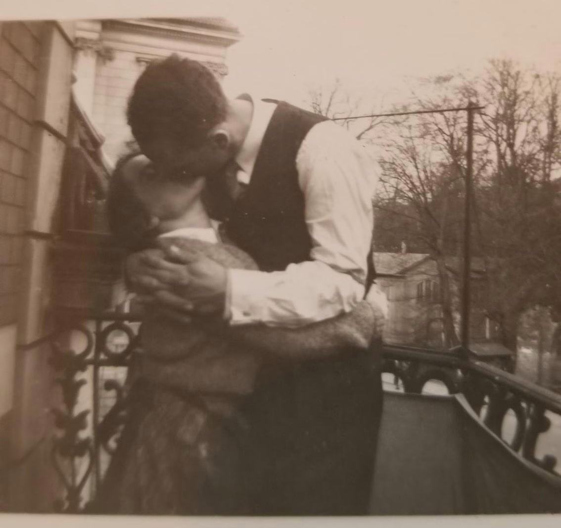
Before the actual design process begins, I send Cole a collection of files with information to inform and inspire him. For Ashes and Ruins, I sent him a brief book description, some photos (both my own and from stock photo collections), a selection of typical covers of published historical fiction novels, and a few ideas I envisioned. Cole took all my input, researched WWII and Blitz images available for free on stock photography sites, and created three “starter” designs. I was delighted to see that all of them featured my family photo of Edith (one of my story’s protagonists) embracing her husband.
Dozens of back-and-forth emails ensued. Mine usually began with “Can you add…?” “Can you change…?” or “Can you modify…?” or something of the like. Cole’s responses came back like clockwork—always with the requested suggestions beautifully implemented. Finally, we narrowed our choice to two:
1. A London scene with airplanes overhead and a romantic image in the clouds.
2. A collection of items from the story (the photo, a ration book, a stack of letters, a locket, and a bouquet of daisies) against a background of ruined, bombed-out buildings.
As my own publisher, I use a trusted circle of writers, friends, family, and my editor to gather initial input when I need fresh eyes on marketing issues. Their responses to the two covers were helpful, though their choice of a favorite was split right down the middle. Cole and I began another round of modifications based on my “team’s” feedback. As we worked, I got an additional idea. I asked Cole to create a cover that used the British and German flags as design elements.
He sent back a dynamic and visually impactful design. It hit all the marks except one. It did not convey the tone and content of Ashes and Ruins, a story of domestic and romantic life during wartime rather than a high-suspense war adventure. I wrote to Cole saying, “I may have to write a thriller so I can use this fabulous cover design!”
To add to the complexity, while waiting to see Cole’s next changes, I read an article on cover design. “Essential Elements of the Best Book Covers” published on The Write Practice website (thewritepractice.com), caught my attention. In the article, Vasylysa, who works with Miblart, a book cover design company, wrote, “The problem is that as the author, sometimes you’re focused on small story elements instead of the overall impression the cover gives your reader. Your cover needs to make a promise to the reader about what’s inside and what to expect without delving into details.” Her words really hit home.
Worried that our design with the assortment of items in the middle was exactly what Vasylysa was talking about, I asked Cole to simplify it. However, because the first “busy and detailed” version had been a test favorite, I’m still considering it. Thus, I am still looking at three choices! Two are similar, one less cluttered with detail than the other. But I love all three. How can I decide? What to do?
Which cover would most make you reach for this book, linger to read the description and review excerpts on the back, and maybe tuck it into your shopping cart?
A. London scene w/planes B. Ruins w/ration book C. Ruins w/photo & letters
Sign up to receive the latest news, events and personal insights from Katie Lang‑Slattery.
Leave a Reply